Websites need to have text that is easy to read for everyone, including people with visual impairments. There are specific WCAG 2.0 AA criteria that a site needs to meet to be compliant. This is done by checking color contrast. WCAG 2.0 AA criteria say small text needs to meet a 4.5:1 ratio. Large text needs to meet a 3:1 ratio.
If you are not a technical person the "Color Contrast Analyzer" Chrome extension is the quickest way to check for contrast problems.
Simple contrast testing
Step 1: Enable the "Color Contrast Analyzer" Chrome extension and
Step 2: Read its "Overview".
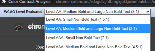
Step 3: Choose which kind of text you want to check.

Step 4.a: Test once for large text with "Level AA, Medium Bold and Large Non-bold (3:1)". This usually means headings.
Step 4.b: Test once for small text with "Small Non-Bold and Large Non-Bold (4.5:1)". This usually means normal body text and links.
Step 5: Review the results.
- If the corresponding test comes back with text outlined in white, it's probably good.
- If it does not, it probably needs a little CSS help to increase the color contrast. Ask a web developer friend for 15 minutes of their time, or email web-accessibility@duke.edu, if you are a Duke employee and this is a Duke affiliated website.
Step 6: Check your links for contrast issues. Sometimes text is good, but the hover states don't meet the threshold necessary for compliance.
Example test page:
The text outlined in solid white does meet the contrast ratio threshold.
Website with low contrast
Analyzed by Color Contrast Analyzer
Other Checkers:
The Color Contrast Analyzer Extention gives you a big picture view. There is a lot of contrast checkers out there. Sometimes they miss things and sometimes they produce false positives.