
For a menu to be accessible it needs to work for:
- Mouse users
- Touch screen users
- Keyboard-only users
- Screen reader users
Bootstrap example:
Other options:
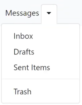
Other accessible options exist, like a split toggle. It uses a similar technique but allows for the top-level link (Messages) to be clickable and go to a webpage. The down arrow would become a toggle button.

The code for this would look something like the following:
```
<li>
<a href="/go-somewhere">Messages</a>
<button class="arrow" aria-haspopup="true" aria-expanded="true"><span class="element-invisible">toggle sub nav</span></button>
<ul>...</ul>
</li>
```
NOTE: The aria-expanded attribute toggles. When the menu is visible it should be "true" when hidden it should be "false".
The .element-invisible class would visually hide the "toggle sub nav" text but is still availible to screen reader users. Some frameworks use the .sr-only class to do the same thing.
```
.element-invisible {
position: absolute;
width: 1px;
height: 1px;
padding: 0;
margin: -1px;
overflow: hidden;
clip: rect(0,0,0,0);
border: 0;
}
```
Do not use display:none to hide the "toggle sub nav" text! For screen reader software it is the same as deleting it from the DOM.