Image

Affordance means that the purpose of an element can be inferred by its sensory characteristics. There are three main factors at play. First, links and buttons must be visually distinguishable from surrounding non-link text. Second, the Hover states on interactive elements, like links and buttons must also be distinguishable for mouse users. Third, there must be a Focus state for keyboard-only users.
Example of poor link text color
This dark grey link text with black text does not have enough contrast or other indication.
Example of good link text color
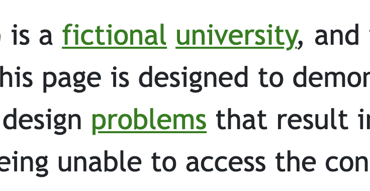
The good example has a green color that is easily identifiable compared to the text around it. It also utilizes an underline to make it even more clear that it is clickable. In this case only one of them would be required. But people like to know what to click on, so we used both.
The minimum requirement for link text is to meet a 3:1 contrast ratio compared to text around it, or have some other visual indicator, like an underline.
Another required indicator for mouse users is the existence of a Hover state. The following video explains how to check for Hover states.
Keyboard only users require a keyboard Focus indicator to know what element has Focus. The following video explains what a Focus state is and how to check for it.